7 Best Squarespace Font Pairings for 2025
Choosing the right font pairing for your website is crucial—especially if you want your design to feel fresh, professional, and impactful. Whether you're working on a Squarespace site for a business, blog, or personal brand, a well-chosen font combination can elevate your message and create a lasting impression. Below are seven standout font pairings perfect for Squarespace sites in 2025, with notes on why each duo works so well together. Let’s dive in!
Best Squarespace Font Pairings for 2025
1. Aktiv Grotesk and Brix Slab
Aktiv Grotesk: Modern and versatile, Aktiv Grotesk brings a clean, professional vibe to headings. It’s ideal for designs that need both clarity and a touch of warmth. Its straightforward letterforms make it approachable and highly readable, while still feeling fresh and contemporary.
Brix Slab: For body text, Brix Slab adds a friendly sophistication with its structured, slightly chunky forms. The slab serif design brings character to paragraphs, creating a balanced, approachable look that pairs seamlessly with Aktiv Grotesk. Together, this pairing achieves a perfect mix of professionalism and charm—great for brands that want to be both authoritative and welcoming.
Best Used For: Consulting Agencies, Health & Wellness Brands
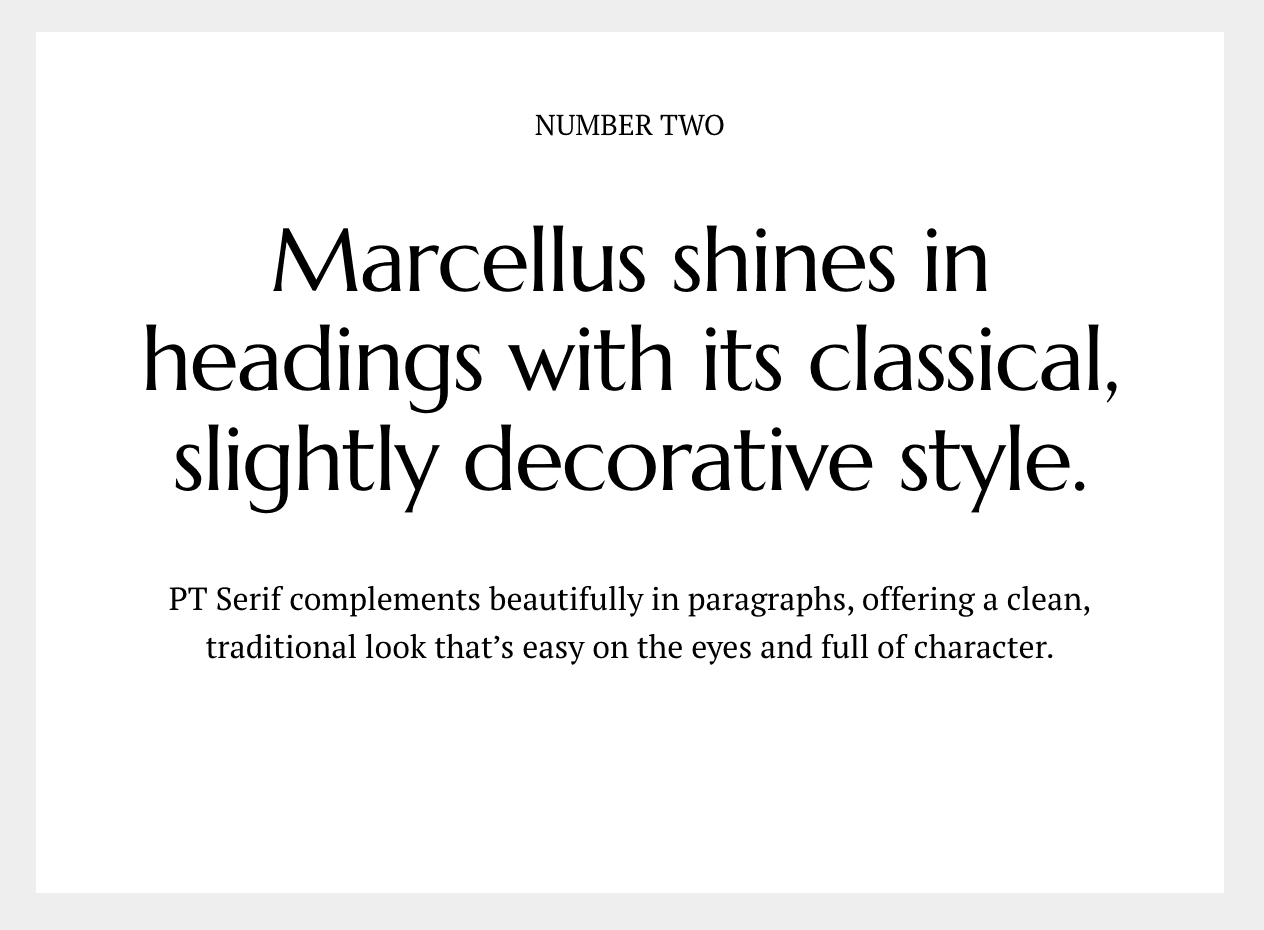
2. Marcellus and PT Serif
Marcellus: Marcellus has an elegant, timeless quality that feels sophisticated without being pretentious. It’s a beautiful serif font for headings, giving your site a refined look without going overboard. Marcellus is ideal for creating a classic, professional atmosphere with a touch of warmth.
PT Serif: When you need to display a lot of content, readability is key. PT Serif complements Marcellus beautifully, offering a clean, traditional look in the body text that enhances long-form readability. This pairing works well for sites that want a classic style, like publications, portfolios, or personal brands with a focus on storytelling.
Best Used For: Art & Design Portfolios, Educational Blogs
3. Anton and Epilogue
Anton: Bold and impactful, Anton grabs attention with its strong, modern style. It’s perfect for powerful, eye-catching headlines that demand a second look. Anton’s bold weight and straightforward lines make it a fantastic choice for making a statement.
Epilogue: To balance Anton’s intensity, Epilogue brings a smooth, versatile feel to body text. Its clean, modern look keeps things grounded and readable, providing an elegant contrast to Anton’s boldness. Together, they create a dynamic pairing that is both modern and balanced, making this duo ideal for creative agencies, portfolios, or businesses that want a bold yet polished aesthetic.
Best Used For: Creative Agencies, Tech Startups
4. Young Serif and Bitter
Young Serif: With a whimsical twist on the classic serif, Young Serif feels both traditional and playful. Inspired by fonts like Plantin Infant and ITC Italian Old Style, it brings a touch of personality that makes headlines feel approachable and engaging. Young Serif’s distinctive style makes it perfect for brands that want to stand out with a unique, slightly nostalgic flair.
Bitter: As a contemporary serif designed for optimal readability in digital contexts, Bitter is the perfect partner for Young Serif. Its clean, straightforward forms make it easy to read across devices, especially in longer paragraphs. This pairing brings a delightful mix of personality and practicality, ideal for blogs, creative portfolios, and editorial sites.
Best Used For: Lifestyle Blogs, Craft & DIY Brands
5. Ultra and Work Sans
Ultra: For those who want to make a bold impression, Ultra is an eye-catching, ultra-bold slab typeface inspired by classic wood type styles like Clarendon and Egyptian. Its dramatic letterforms and serious yet approachable style make it ideal for titles and headlines that pack a punch.
Work Sans: Work Sans is a humanist typeface inspired by classic grotesques, but with a fresh, modern twist. Its open, airy letterforms bring a clean, approachable look to body text. This pairing works beautifully to create a strong visual hierarchy while maintaining a modern and friendly feel—perfect for websites that want a powerful yet personable vibe.
Best Used For: Food & Beverage Brands, Nonprofits
6. Syncopate and Space Grotesk
Syncopate: Syncopate brings a rhythmic, bold feel to headlines. With its unique letterforms and dynamic look, it adds flair and personality to any design. Syncopate’s modern edge makes it ideal for eye-catching titles that leave an impression.
Space Grotesk: Space Grotesk complements Syncopate with its clean, geometric precision and warmth. This versatile sans-serif is both stylish and highly readable, making it a great choice for paragraph text. Together, Syncopate and Space Grotesk create a polished and contemporary pairing that’s perfect for modern, visually-driven brands.
Best Used For: Fashion & Beauty Brands, Entertainment Websites
7. Archivo Black and Archivo
Archivo Black: For impactful headings, Archivo Black delivers with its strong, bold lines. This sans-serif is perfect for making a statement in headlines, commanding attention without overpowering the design.
Archivo: To balance the boldness of Archivo Black, Archivo provides a sleek, legible choice for body text. With a clean, neutral style, it complements Archivo Black seamlessly, creating a cohesive, professional look. This pairing is ideal for businesses that want a straightforward, modern design that’s both readable and refined.
Best Used For: E-commerce Stores, Corporate Websites
Wrapping Up
Choosing the right font pairing is essential for setting the tone of your website. Each of these combinations brings a unique balance of personality and readability, helping you create a design that’s both beautiful and functional. Whether you’re going for bold and modern, classic and elegant, or playful and unique, these font pairings are perfect for Squarespace sites in 2025. Try them out, and see how the right typography can transform your website’s look and feel!


